PivotTables & Charts - Is Your Excel Data Delivering the Impact it Deserves?
You spend hours in your Excel spreadsheets collecting, setting up, entering, tracking, and maintaining valuable data. But your time can seem fruitless if it doesn’t get the attention it deserves when viewed by others. If you really want to ensure others take notice and understand your data, make it visual with a PivotTable or Chart. A picture is worth a thousand words, or in this case, datapoints. Utilizing these valuable tools in Excel can make your data more impactful and help others better digest it.
In AdvantEdge Training’s Excel Pivot Tables & Charts 4- hour course, we cover how to use these tools as well as unique techniques to help them deliver even more punch! Such as:
PivotTables
- How you can manipulate your data with a PivotTable while leaving your original data intact
- How to sort and filter in PivotTables
- Creating new sub tables from a PivotTable
- Formatting PivotTables with styles and conditional formatting
- Layouts and other view settings
- Using value comparisons and various total options
- Creating calculated fields and items
- Creating PivotTables with multiple data sources
- Creating and using Pivot Charts
Charts
- The difference between single and multiple series charts
- Adding data labels, titles, gridlines, and other chart features
- Customizing individual data points, chart backgrounds, and theme elements
- Creating charts from non-consecutive data
- Using a secondary axis
- Replacing datapoints with shapes
- Adding callouts
- Analysis tools
- Adding trendlines
- Unique chart types
- Doughnut
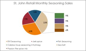
- Sub-Pie
- Paired Bar
- Radar
Learn all of these topics and more. Whether you’re new to these tools, or want to sharpen your skills with more visual impact, this course is for you! Register now for our next Virtual Training Center session on May 28th.