 Excel Charts are critical to business reports because they are far more engaging than matrices of numbers.
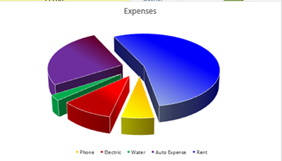
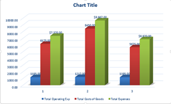
Charts must be accurate and aesthetically pleasing to the eye. The wrong chart type can mislead or inaccurately represent data. For example:
- A column chart emphasizes variation over a period of time.
- A bar chart compares values over several variables
- A line chart shows progression or change.
- A scatter chart compares data that isn’t in a series
- A surface chart shows data over 3 dimensions.
- A pie chart shows the relationship of the parts to the whole