Using a secondary Y-Axis in an Excel chart can help different types of data display better together on the same chart.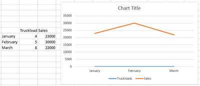
For example, a data set that includes the number of truckloads sold and the dollar value sold will not show up well on a chart because there are fewer truckloads than dollars. In this case the 2 data points seem very far apart and not relevant to each other.
To make the truckloads tie in better with our other datapoint, we need to add a secondary Y-Axis.
 1. Create your chart as you normally would, including all of the data you want shown.
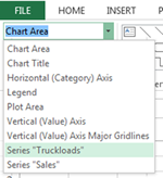
2. Select the chart and click on the Format tab.
3. In the Current Selection tab, use the drop down to find the data that isn’t showing up well, in this case, I chose Truckloads.
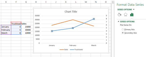
4. Click Format Selection in the same group.
5. In the bar to the right of the data, choose Secondary Axis.
Power up your Excel Pivot Tables & Charts skills with a class from AdvantEdge Training and Consulting