Microsoft has built 3 tools for creating maps in Microsoft Excel, including Power Map, Power View, and the Bing Maps App.
To use these tools, you’ll need to download certain add-ins from the Microsoft site. Of course, consult with your IT guy or IT Support company before making changes to your desktop.
Excel Power Map
Excel Power Map creates images and tours of your mapped data.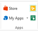
1. First, select your data including location information. The location can be described as longitude and latitude or physical addresses. Dates need date format cells.
2. Click Map under the Insert tab.
3. Use the wizard on the right to identify your location, and click next.
4. Select the data for your chart, including date and time if applicable.
Excel Bing Maps
One of the big changes with Office 2013 was the advent of Apps. Microsoft Office can now be extended by downloading Apps into the software. Bing Maps may already be downloaded into Excel, but if not, you can download and install it with the Store link in the Apps group under the Insert tab.
1. Select your data.
2. Click on the yellow Bing Maps icon under the Insert tab. The map will appear.
3. Use the options at the top of the map to identify which information you want displayed and filter it to your preferences.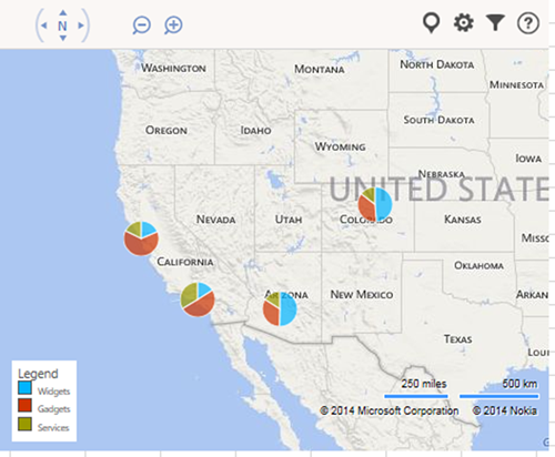
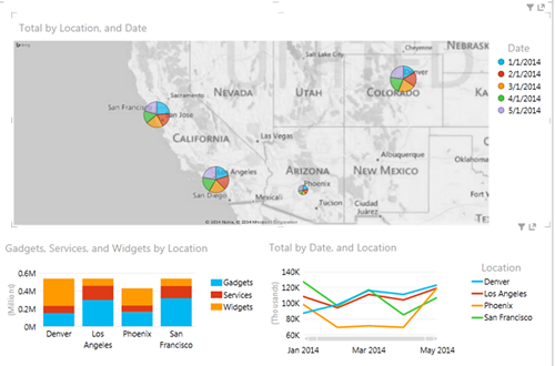
Power View
Power View is the most powerful of these tools in terms of customization.![]()
1. Click on Power View under the Insert tab. Power View will initially look like a spreadsheet of the data.
2. Select the fields you want in the Power View Fields wizard on the right.
3. Select the spreadsheet of data and then click on Maps under the Design tab.
4. Use the fields map on the right to assign each field to the right category.
Once your map is complete, you can create multiple maps or charts on the same dashboard by copying and pasting the map. Reposition it and use the design tab to change its presentation.
The various maps will be interactive and connected to each other. If you click, for example, on Denver in the bar chart, the line graph and map will update to only show the Denver data.