After adding a chart or graph to your Excel workbook, some items may need labeling, in order for management to see details about the data. This is different than a Legend, as that can be added differently to the chart or graph. There are three ways to add or change Data Labels in Excel, and Data Labels can be added to individual data pieces or to the whole chart or graph. We are going to use a Pie Chart for our examples, but the same process can be used for any chart, graph, or PivotChart.
With your chart or graph created, you will need to click the chart or graph once, so that it is selected and Excel knows where to add the labels. Once this is done, follow these steps to add the Data Labels:
First Method –
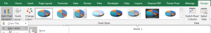
- In the Design tab of the Chart Tools contextual tab, go to the Chart Layouts group on the far left side of the ribbon, and click Add Chart Element. In the drop-down menu, hover on Data Labels.

- This will cause a second drop-down menu to appear. Choose Outside End for now and note how it adds labels to the end of each pie portion.
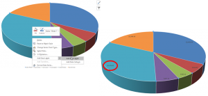
Second Method –
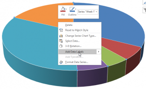
- Right-clicking on the Pie Chart itself will open a menu (shown below), where you can hover on the Add Data Labels arrow to get options.
- The options are the same as in the first option. Once you click on the option, it will add the labels.
- The default position is Inside End, but this can be changed once the labels populate.
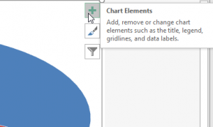
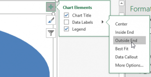
Third Method –
- Click the plus symbol in the top-right corner of the Chart Area.
- When the menu appears, click the pop out arrow and the options for the Data Labels will be listed.
- Select the option you want, and the labels will appear on your chart or graph.
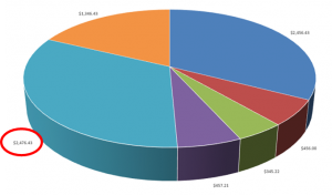
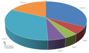
Labels can be added to just one section of your chart or graph as well. This is what it looks like with only one piece of the pie labeled: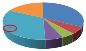
Labels can be extremely helpful in making your point during a presentation, and there are options for the different pieces of information that a label can display.