 Microsoft opened their Office suite to 3rd party development in 2013. In the same way that the functionality of a smart phone can be extended with an app, Microsoft Office apps can be downloaded to add new features.
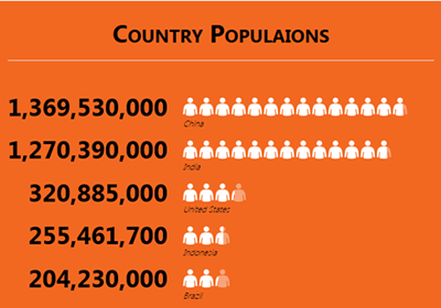
Microsoft itself created several apps, one of which is the Numbers About People App. It creates useful charts to visually represent data.
Get the data
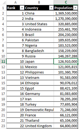
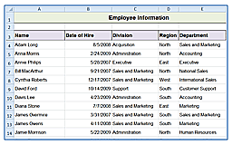
To start with, I needed data. Rather than copying and pasting or manually entering data, I clicked on the From Web option under the Data tab. I searched for the Wikipedia page for countries ranked by size of population and clicked import.I had to clean up the data a little. If this were a permanent project, I might want to use Power Query so that future changes to the data can be reflected in the graphs without manual intervention. For the purposes of this exercise, I just deleted rows and reformatted the information manually.
Using the App
Once the data was ready, I clicked the Numbers About People Icon in the Apps Group of the Insert tab. (Even if you have Excel 2013, your screen may look different depending on how it was installed.)
I clicked the calculator Icon in the top right hand corner to select my data and clicked ok. The gear controls which icons and colors are used.
Find other apps to use on the Microsoft Office App Store with the Store icon in the Apps group of the Insert tab.
To learn more ways to make Excel work for you, take a training class from AETC